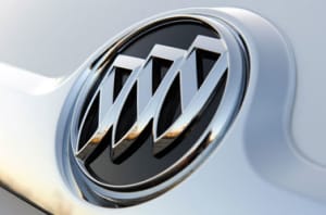
Buick's logo is about to receive a relatively major update. The new-look emblem appeared in a trademark filing in March 2022, and a leaked image posted on social media has given us a better look at the design that should appear on production cars in the not-too-distant future.
Published on Instagram by an account called Buick_Saudi_Arabia, the photo shows what seems to be Buick's new logo on the middle of a steering wheel. The changes made aren't groundbreaking, but they're certainly noticeable. The ring is gone, and the red, white, and blue shields are separated from each other and positioned on the same level. As of writing, the shields are staggered and surrounded by a ring.
View this post on Instagram
One question that comes to mind is: why now? Buick has used its current logo for decades without significantly updating it, so what prompted the company to give the design a makeover? Several factors undoubtedly influenced this decision, but one that's worth shining light on is that the brand is no longer twinned with Germany-based Opel. For many years, some Opel-designed models made their way to the United States with Buick emblems on both ends. No one in Europe has heard of a Buick Regal; folks there know the sedan as the Opel Insignia. And, since the visual differences between these cars were often minor, using a Buick logo whose basic silhouette was similar to Opel's logo simplified the design process. Neatly integrating, say, Chevrolet's bowtie-shaped emblem into the Insignia's grille would have been harder, though more improbable acts of badge-engineering have been committed (the Ford Maverick was once a Nissan).
General Motors sold Opel to PSA Peugeot-Citroën in 2017, and both carmakers are now part of Stellantis, so Buick's trans-Atlantic design ties have been cut. Losing the Opel connection gives Buick's design team more leeway to experiment with new ideas, like a revamped logo.
Keep in mind that nothing is official yet. Full details and an explanation of what the new logo means should emerge soon.

Why the shields?
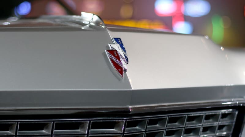
Buick isn't rooted in sword-fighting, so why have shields appeared on its cars for over 60 years? The answer, according to Buick, is relatively vague. What's certain is that the tri-shield logo didn't appear on Buick's early cars. The firm explains that a designer researching the Buick family's history at the Detroit Public Library in the 1930s stumbled upon its ancestral coat of arms: a red shield with a checkered line, a stag's head, and a gold cross. Photos weren't available, so the designer created a new interpretation of it that appeared on Buick's 1937 models.
The two additional shields didn't get added until 1960; the three shields represented the LeSabre, the Electra, and the Invicta, the core members of the Buick range at the time. The emblem evolved over time, and there was a period when Buick also adopted a hawk as a logo.
Related video:
Buick Information


